Introduction
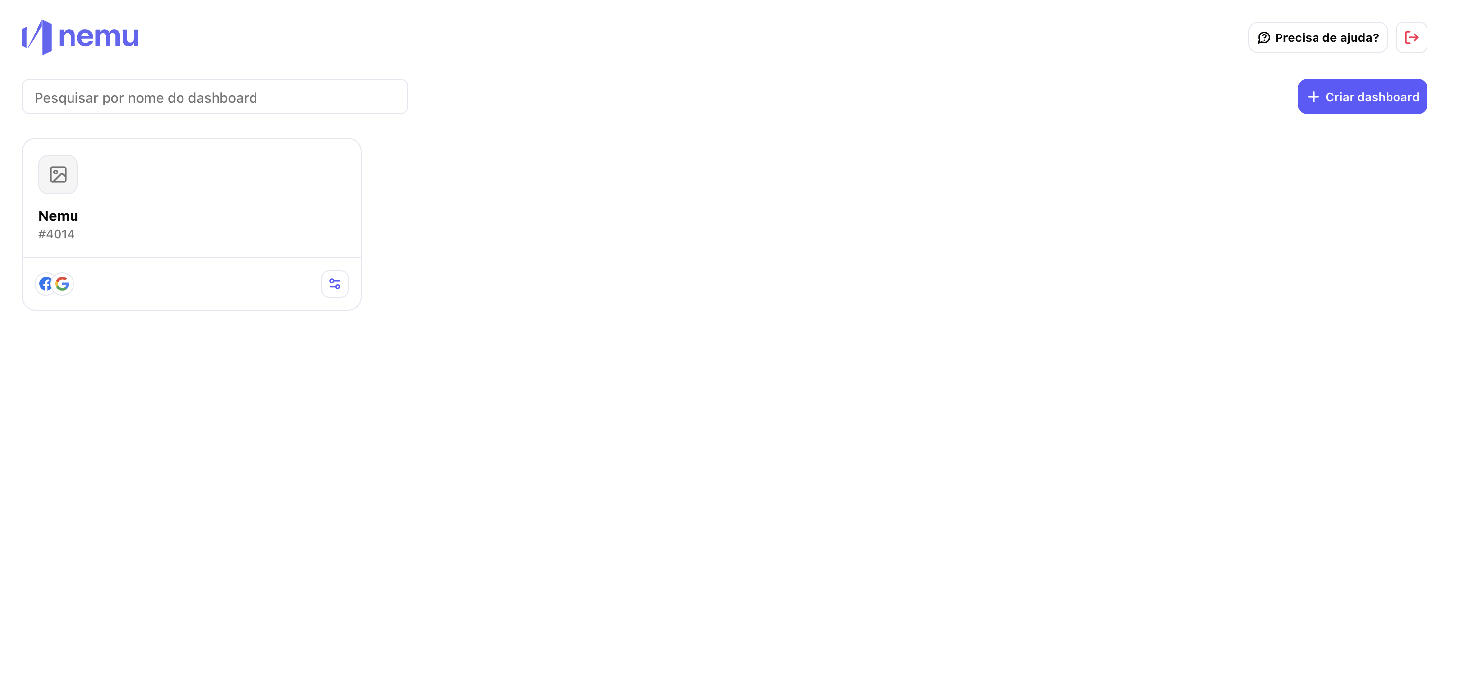
This article provides a visual comparison between the classic version and the new Nemu design. The idea is to help you find your way during the transition and understand where the features you already know are now located. Let’s go:1. Home Screen – My Dashboards
Before (Classic):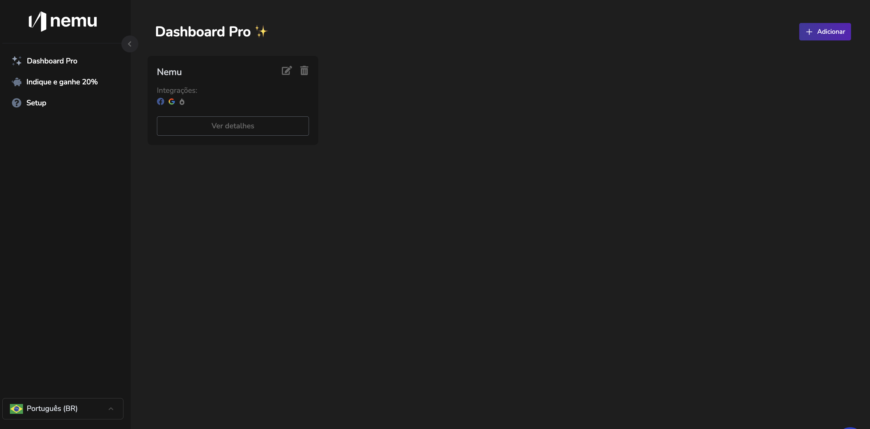
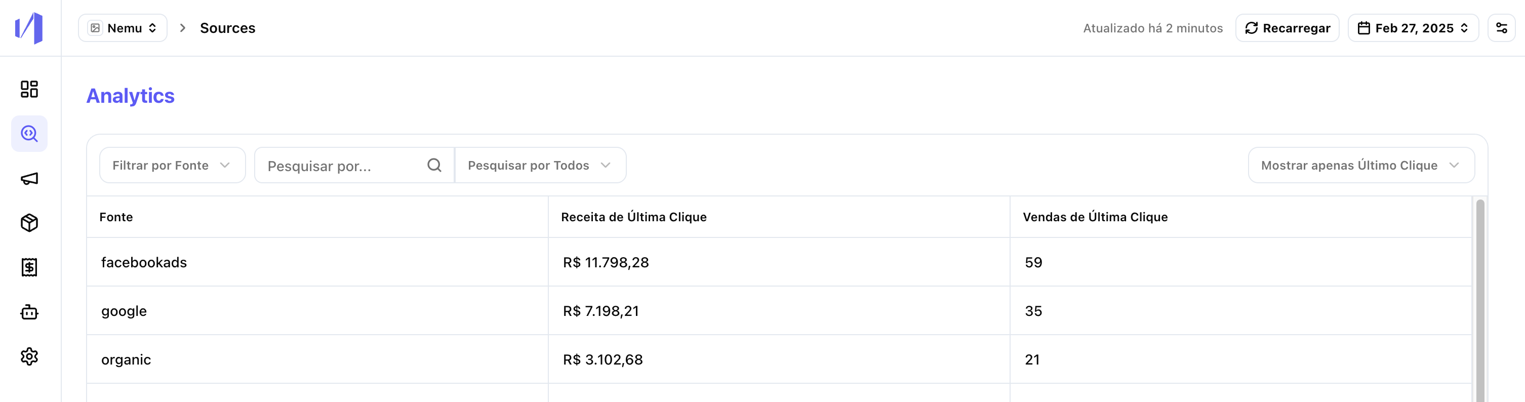
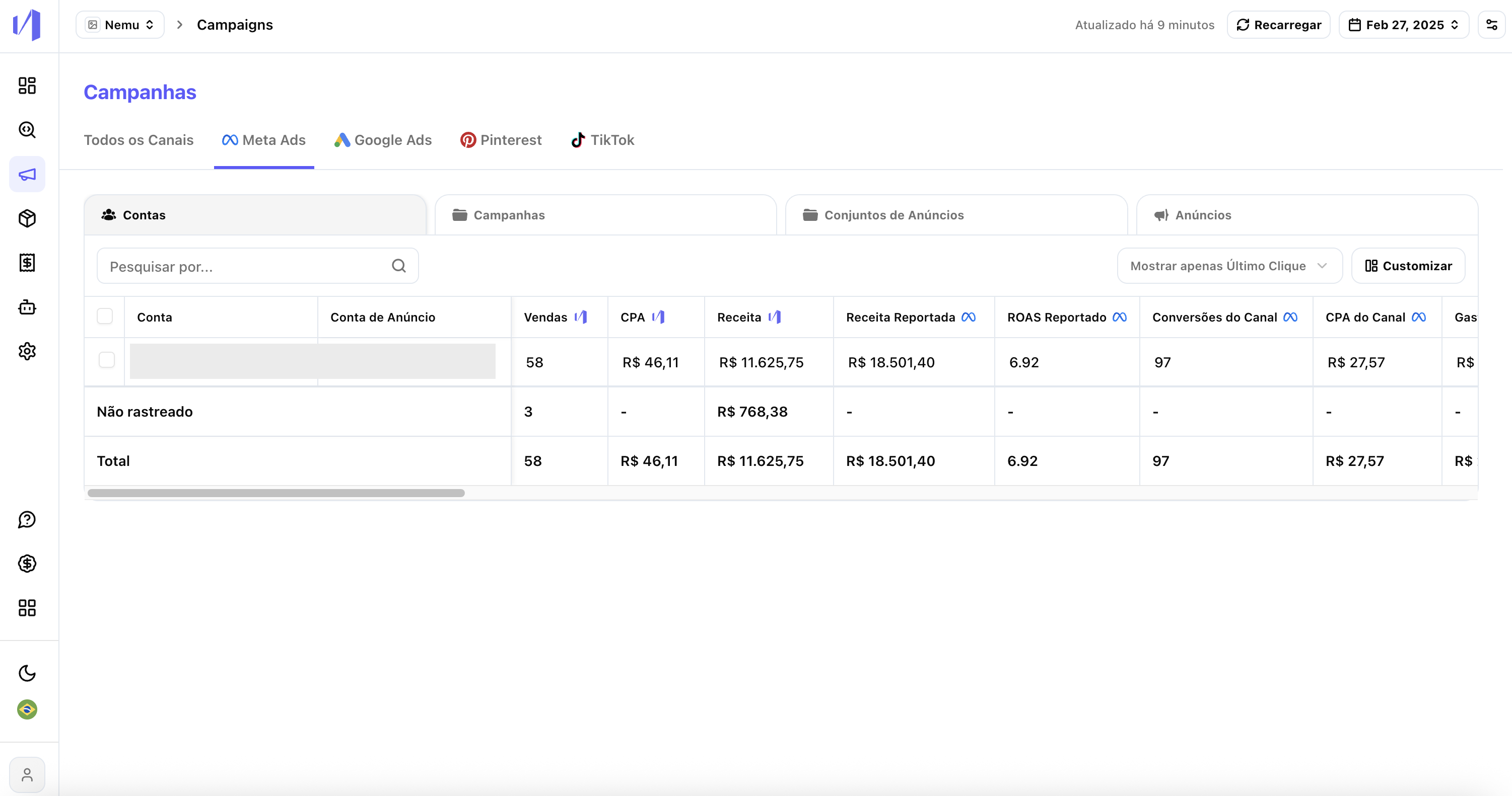
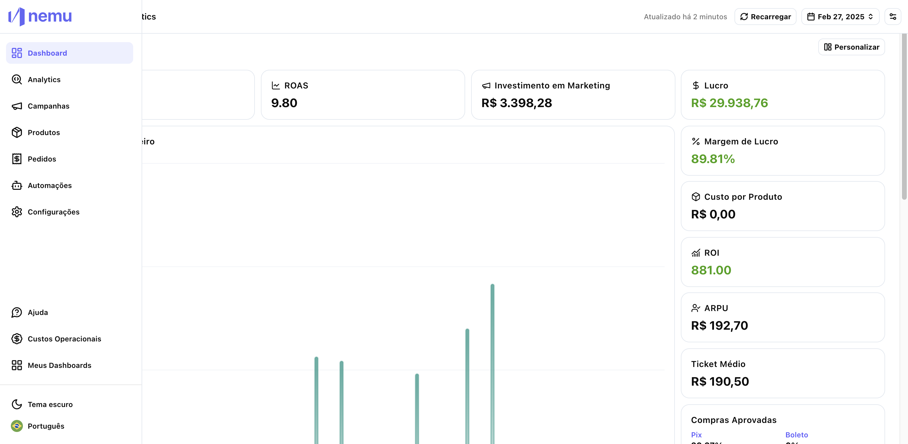
2. Navigation – Sidebar vs. Tabs
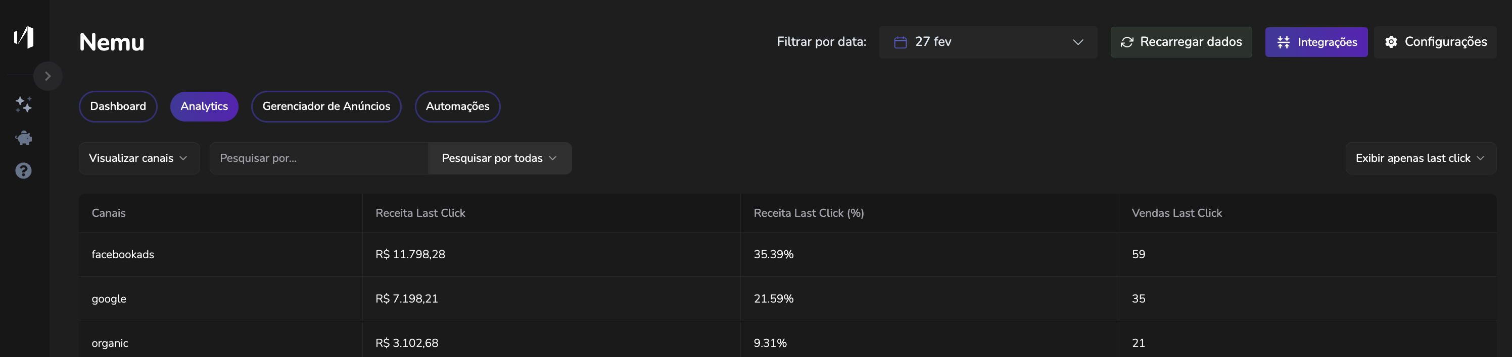
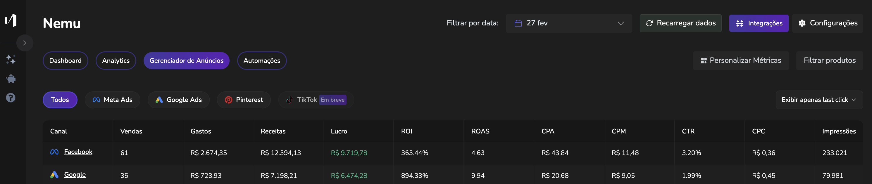
Before (Classic): Tabs at the top with: Dashboard, Analytics, Ad Manager, Automations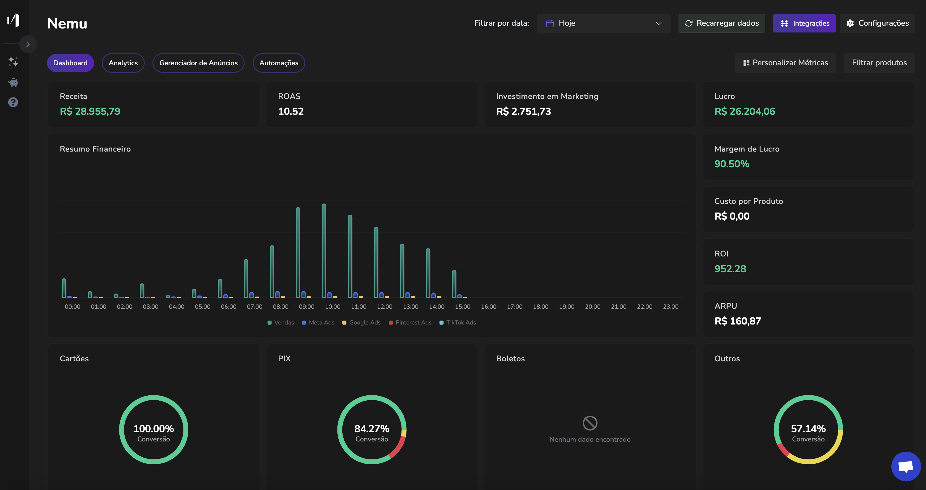
- Dashboard
- Analytics
- Campaigns
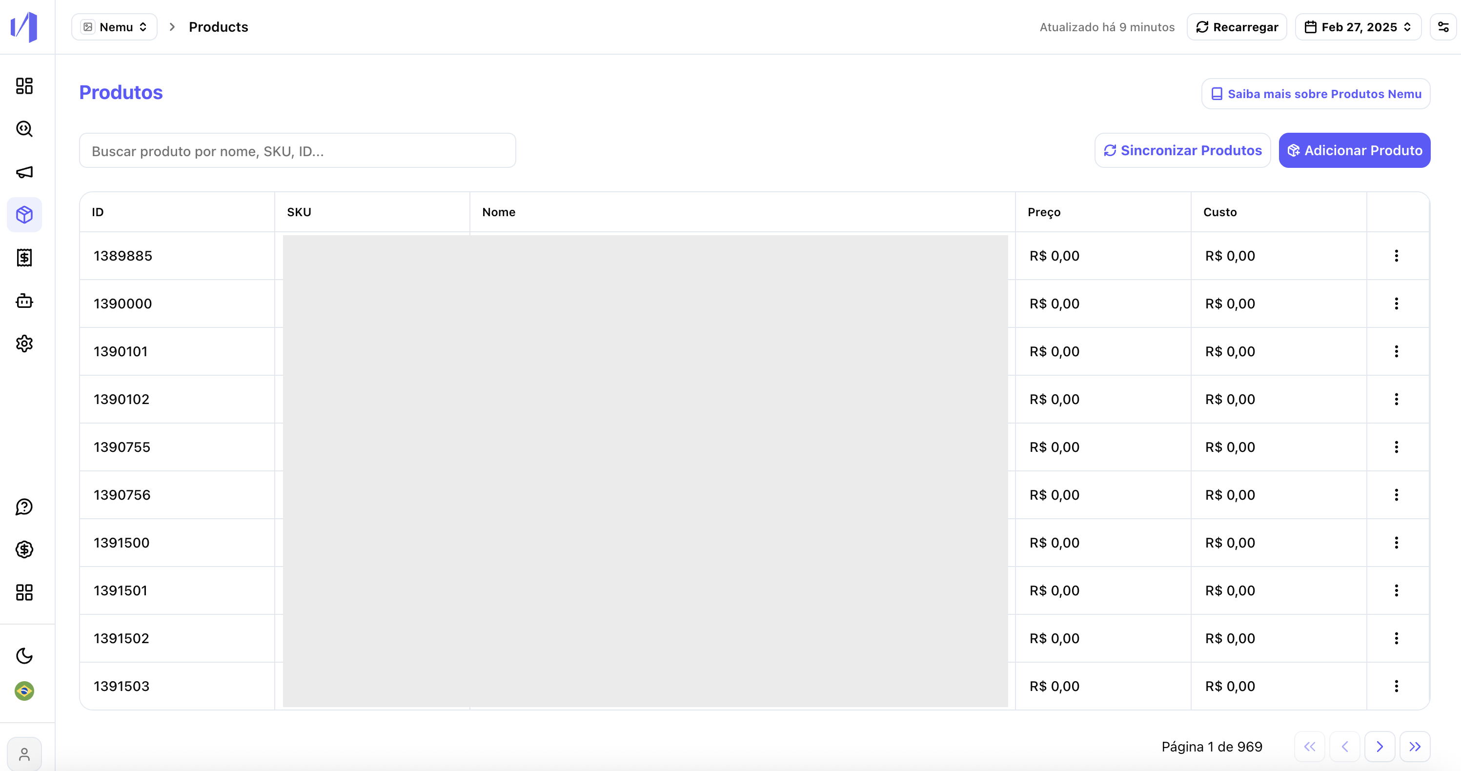
- Products
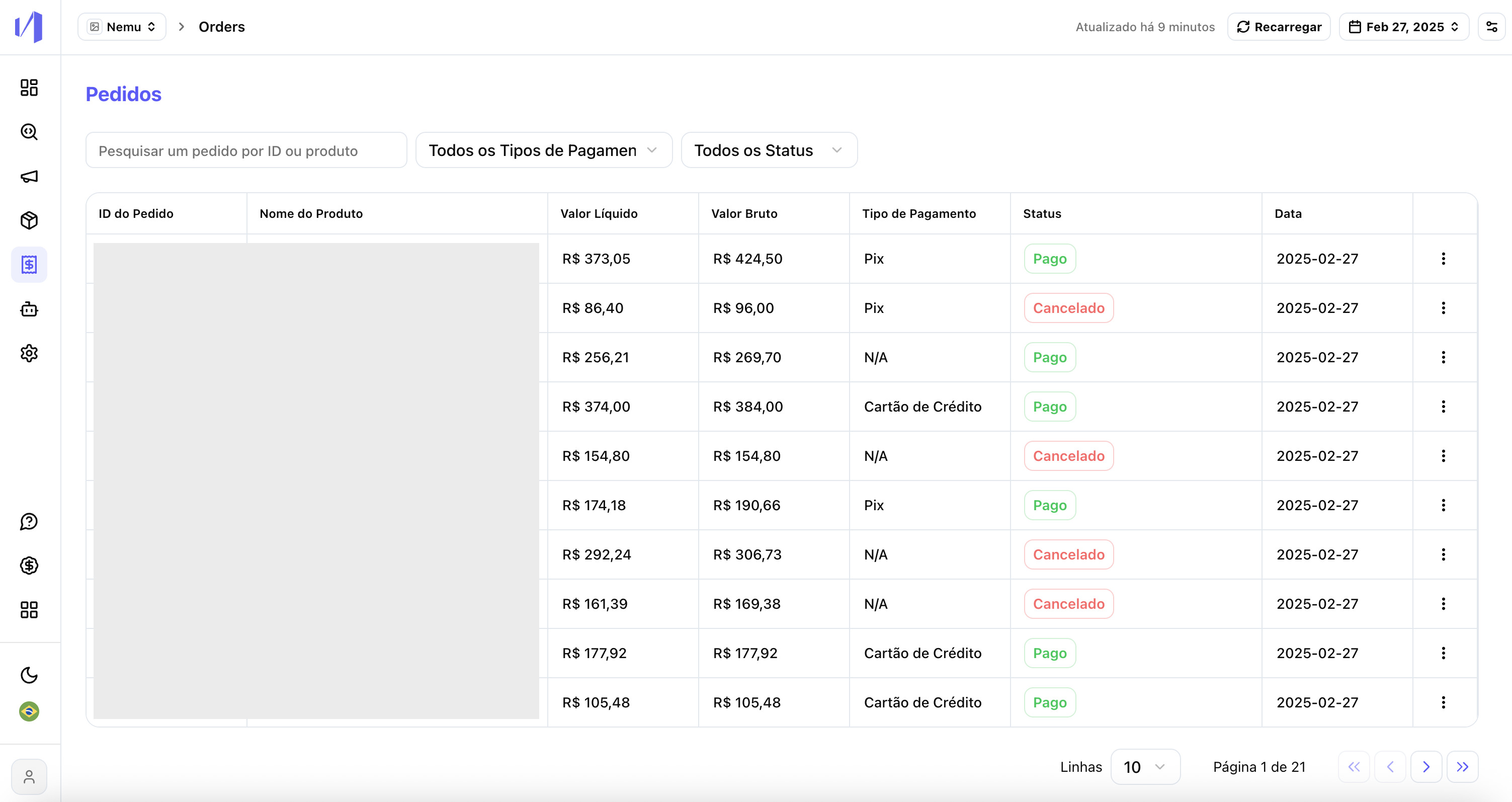
- Orders
- Automations
- Settings
- Help
- Light/dark theme
3. Products and Orders
Before (Classic): Accessed indirectly through “Product Ranking”
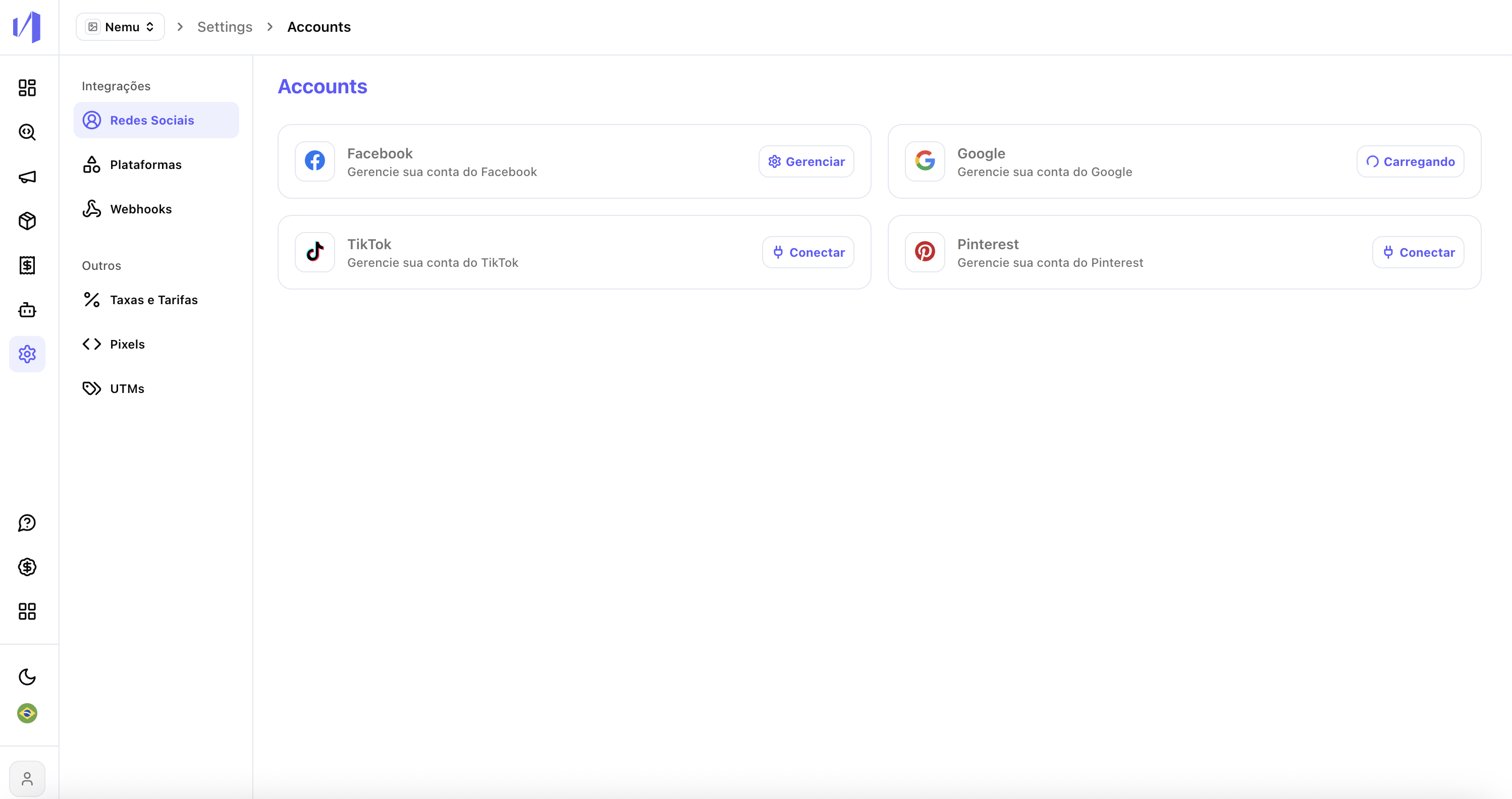
4. Settings
Before (Classic): Settings embedded within the dashboard, with confusing navigation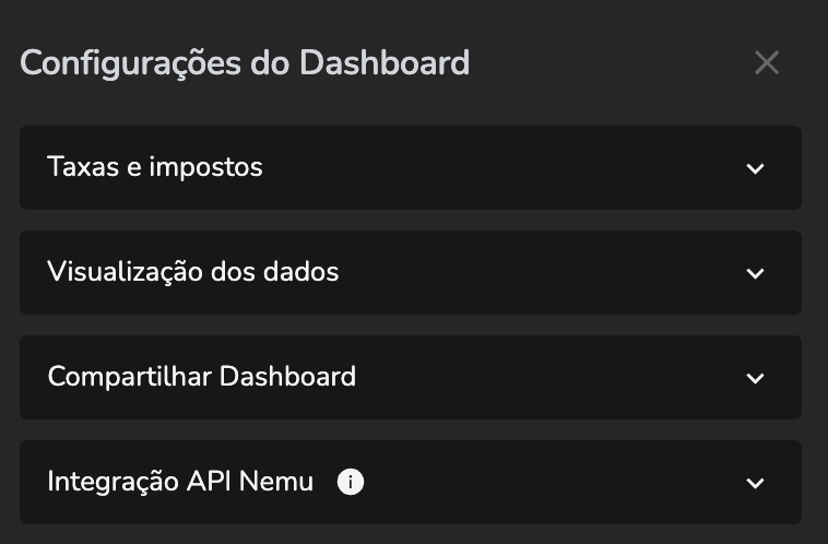
- Social networks
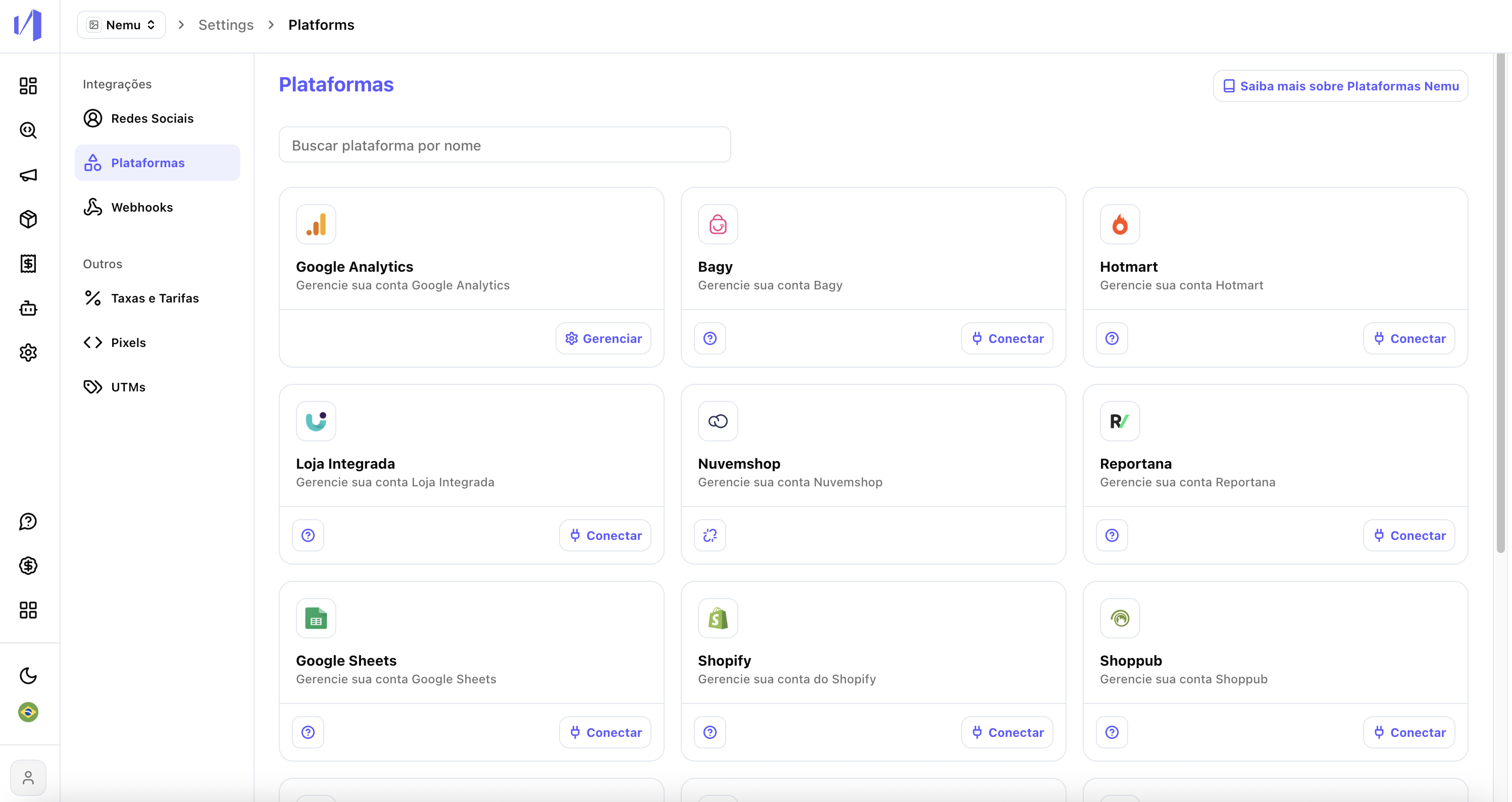
- Platforms
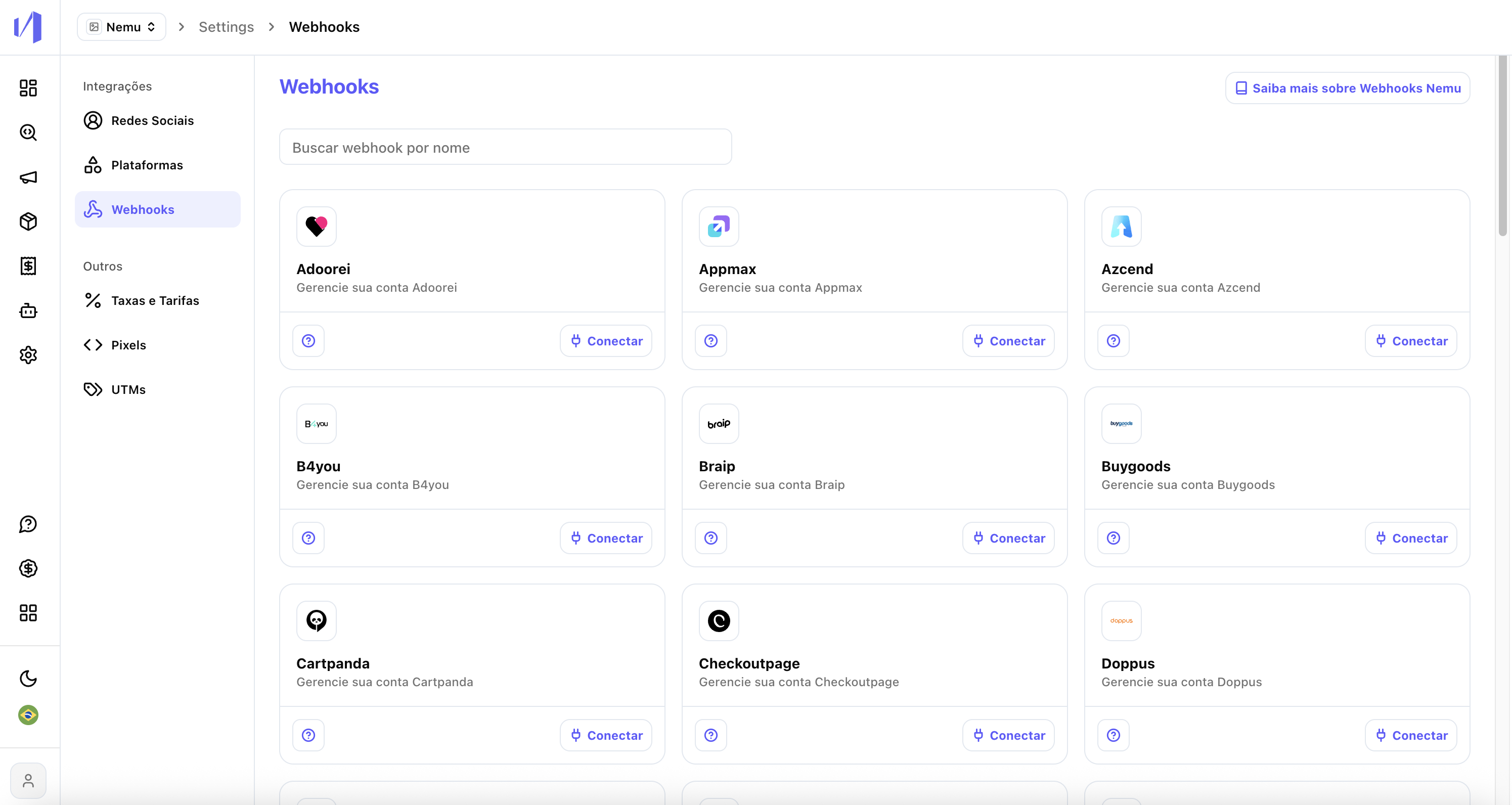
- Webhooks
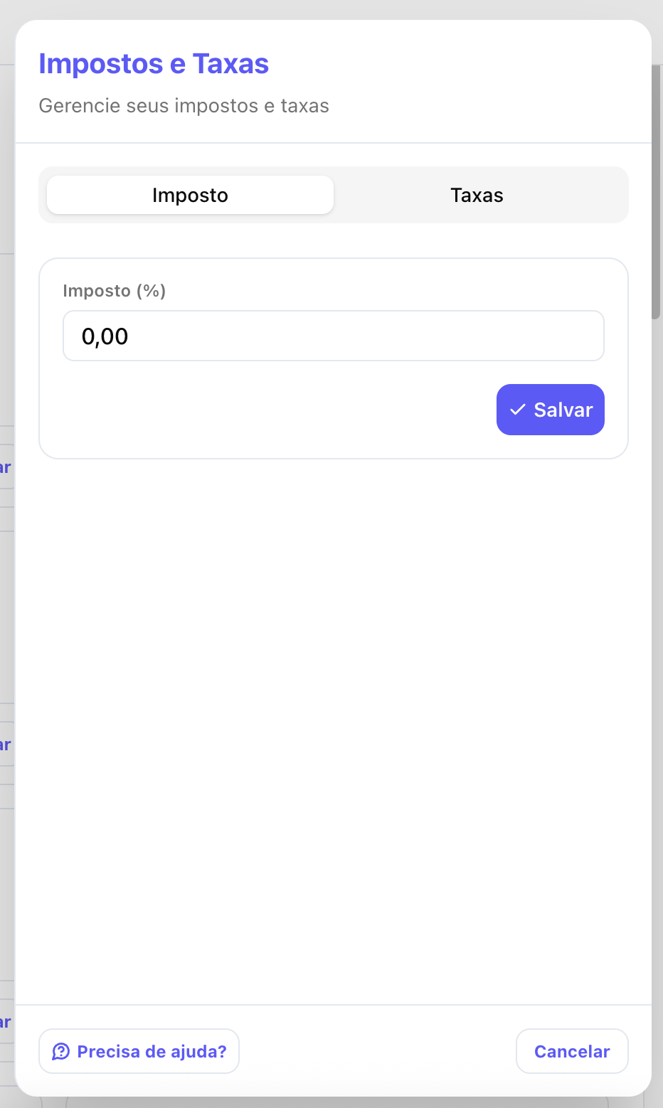
- Rates and fees
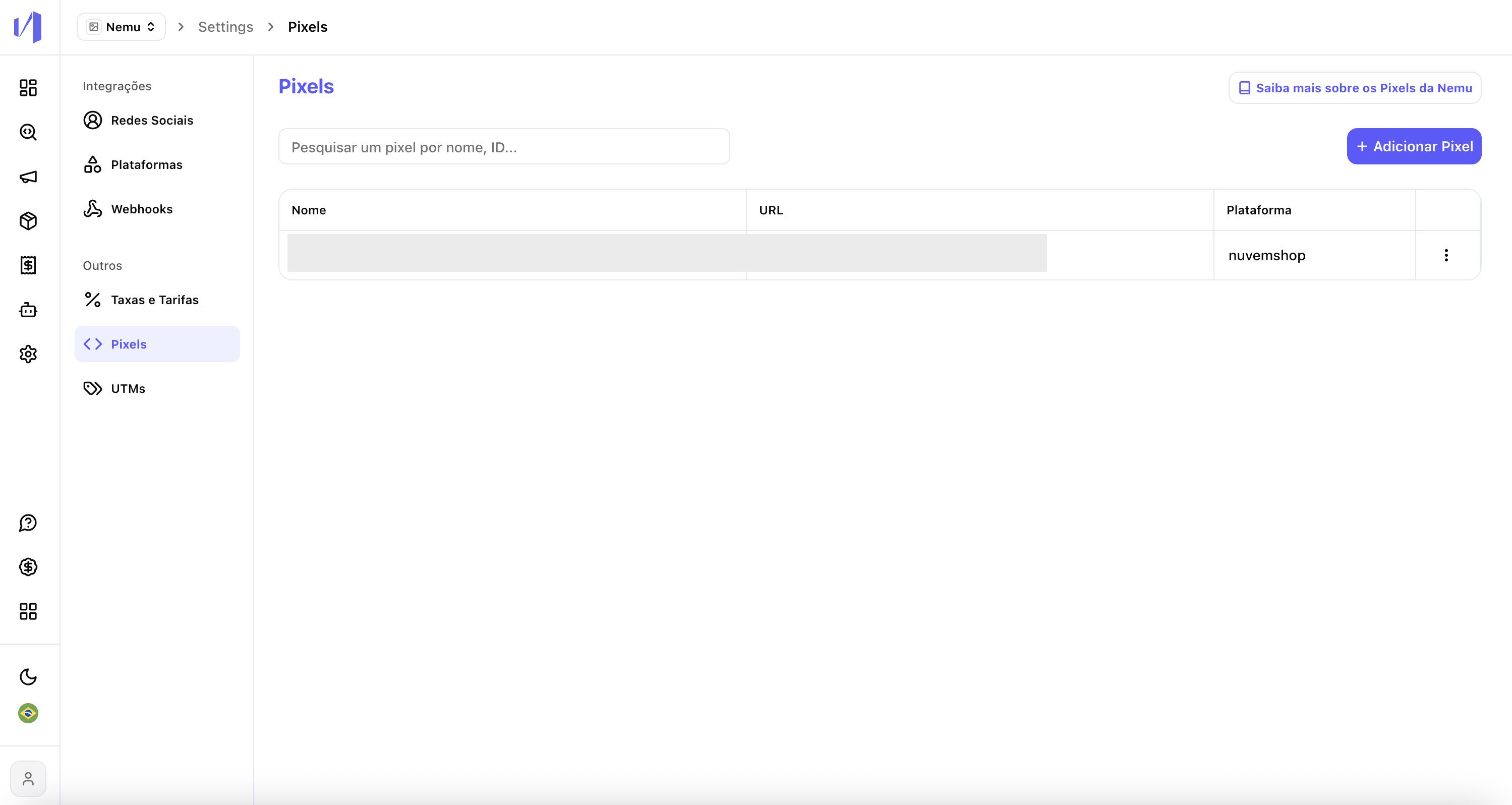
- Pixels
- UTMs
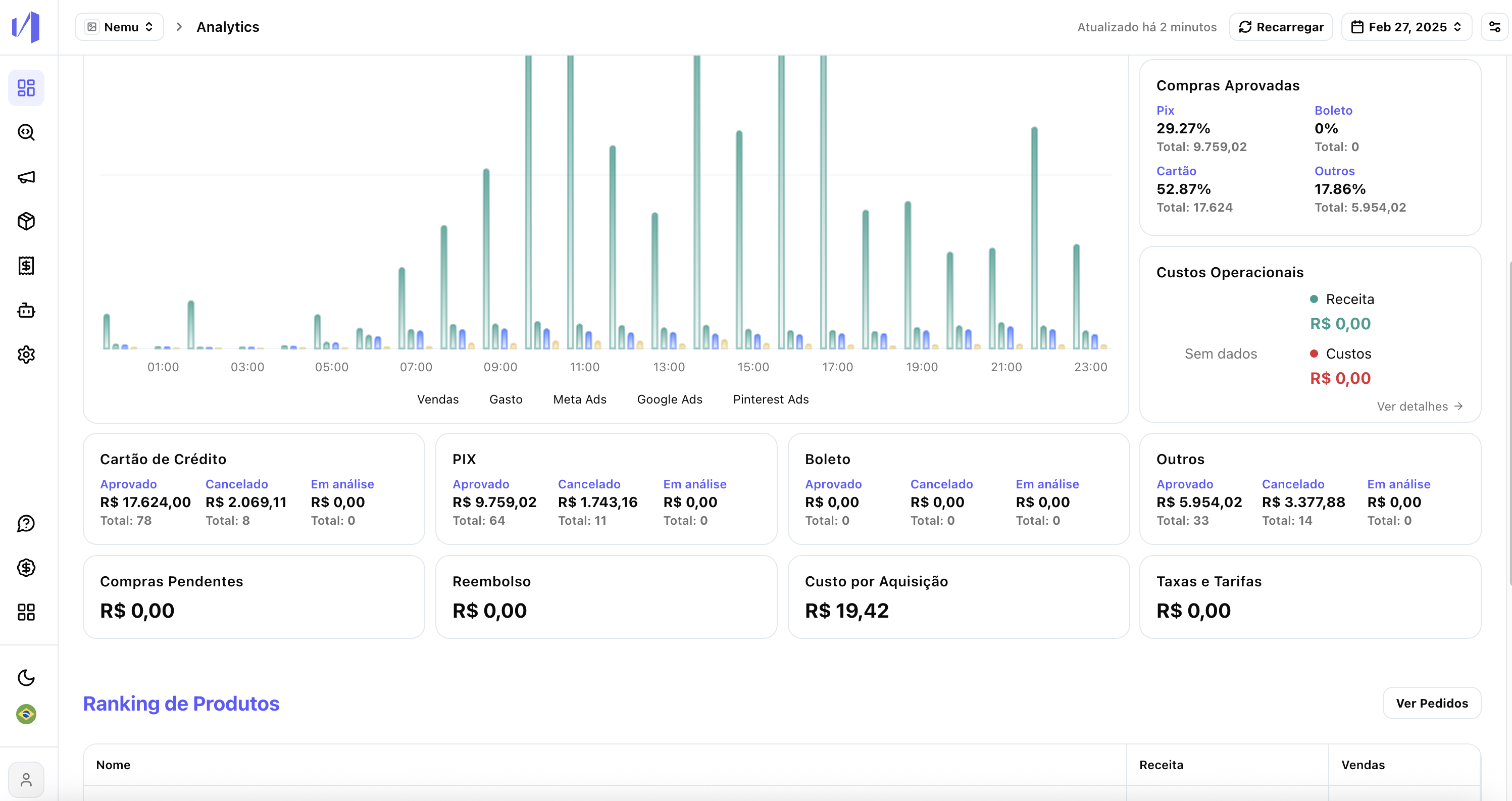
5. Dashboard and Header
Before (Classic): Metrics displayed with filter options in top tabs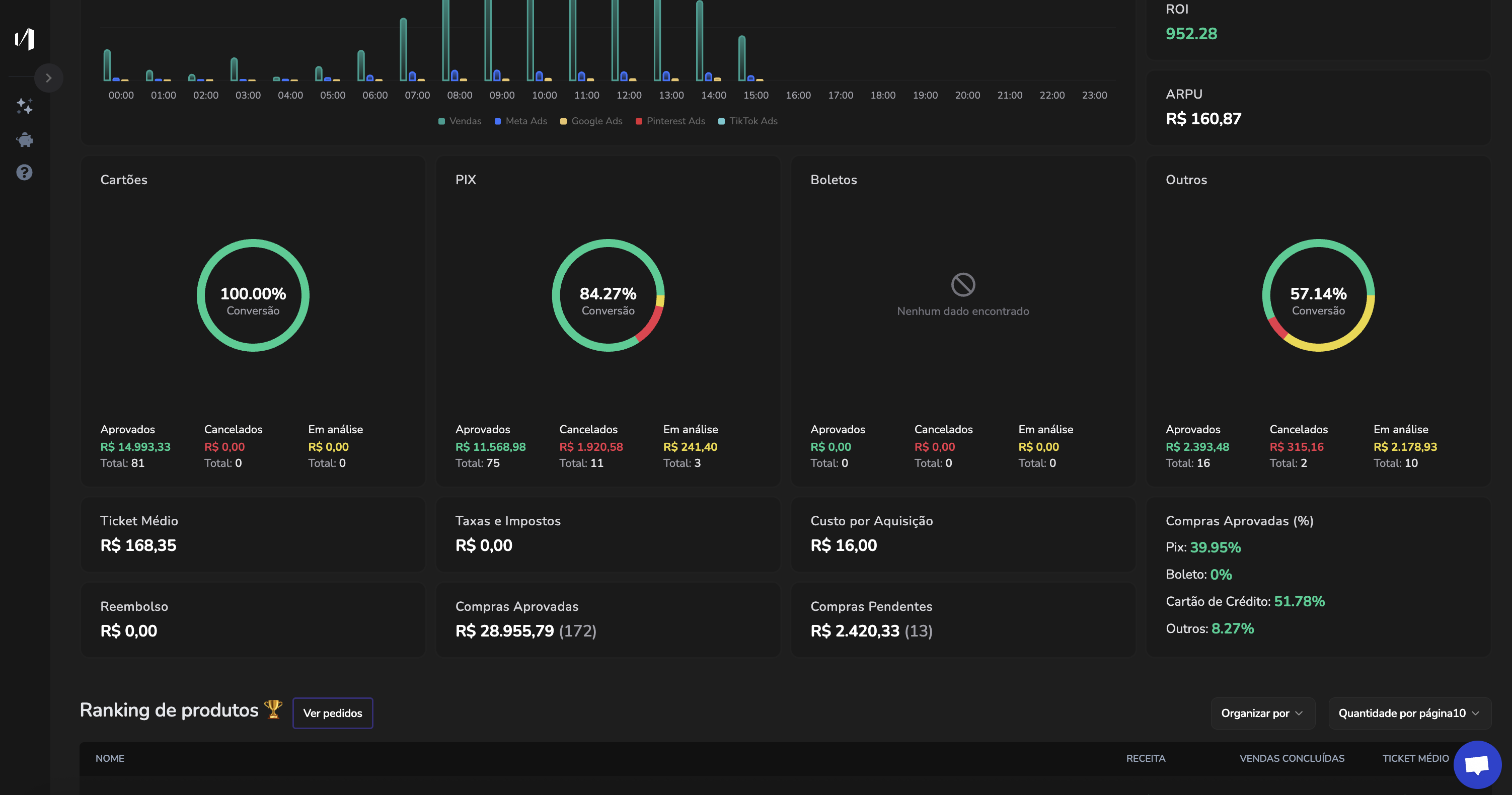
6. Analytics and Campaigns
Before (Classic): Analytics and Ad Manager in tabs